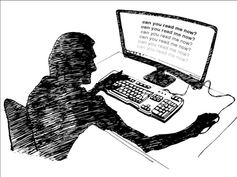
I thought my eyesight was beginning to go. It turns out, I’m suffering from design.
It’s been getting harder for me to read things on my phone and my laptop. I’ve caught myself squinting and holding the screen closer to my face. I’ve worried that my eyesight is starting to go.
These hurdles have made me grumpier over time, but what pushed me over the edge was when Google’s App Engine console — a page that, as a developer, I use daily — changed its text from legible to illegible. Text that was once crisp and dark was suddenly lightened to a pallid gray. Though age has indeed taken its toll on my eyesight, it turns out that I was suffering from a design trend.
There’s a widespread movement in design circles to reduce the contrast between text and background, making type harder to read.
Apple is guilty. Google is, too. So is Twitter.
